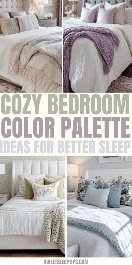
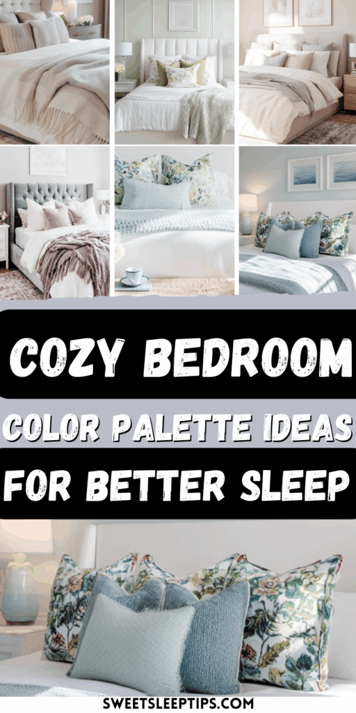
Cozy Bedroom Color Palette Ideas for Better Sleep
Ever wonder why some bedrooms just feel calm, cozy, and ready for a restful sleep? Keep reading to find out how the right bedroom color palette ideas can help you sleep better tonight, too.
I may earn a small commission for affiliate links in this post at no extra cost to you. Please read my privacy policy and privacy page for more information. As an Amazon Associate, I earn from qualifying purchases.
Many years ago, while browsing a busy furniture market, I met a sleep doctor who completely changed the way I think about color in our bedrooms.
He told me that he absolutely loves blue — not just any blue, but soft, calming shades that help him relax and sleep better.
He typically wears the color blue and intentionally surrounds himself with calming blue tones wherever he can.
His dedication to making his world a serene, sleep-friendly place really stuck with me.
That conversation got me thinking: if a sleep doctor believes color can influence relaxation and sleep, shouldn’t our bedrooms get the same thoughtful treatment?
Over the years, I’ve experimented with different home decor colors and seen firsthand how the right bedroom color palette can help people unwind almost as reliably as a new mattress.
To help you find the perfect color scheme for your bedroom, I’ll share simple ideas you can use to build a restful space.
You’ll learn why soft blues, gentle greens, and warm neutrals help you relax, which colors to limit at night, and easy steps to make your room become a sleep sanctuary.
By the end, you’ll have four cozy palettes and quick tips to make your bedroom feel calm, inviting, and ready for sleep tonight.
Ready to get started? Great! Grab a snack, settle in, and let’s get into it!
Why Color Affects Sleep and How to Pick a Bedroom Color Palette
Colors actually talk to your brain — even if you don’t realize it!
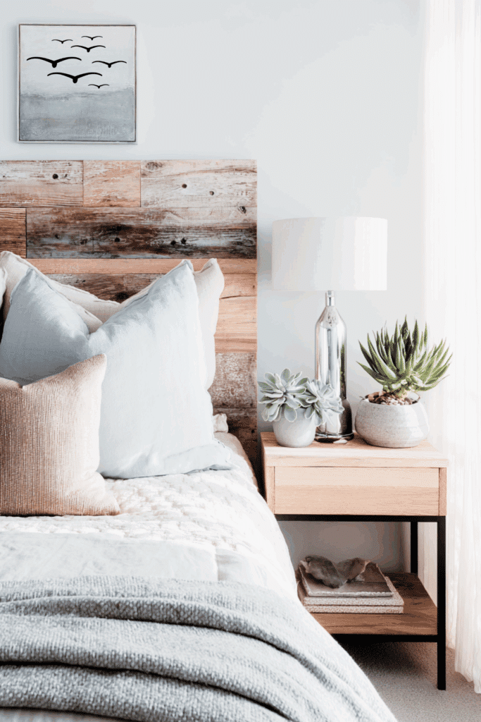
Soft, cool shades like blues and greens can help your mind slow down, while warm, earthy neutrals make your space feel safe and cozy.
This isn’t just decorating advice — our bodies really do respond to light and color in ways that can help us relax and sleep better.
- Soft blues can lower stress and reduce mental clutter. They look quiet and help your heart rate relax.
- Gentle greens feel like nature and balance. Think sage, soft olive, or moss. This family signals restoration and comfort.
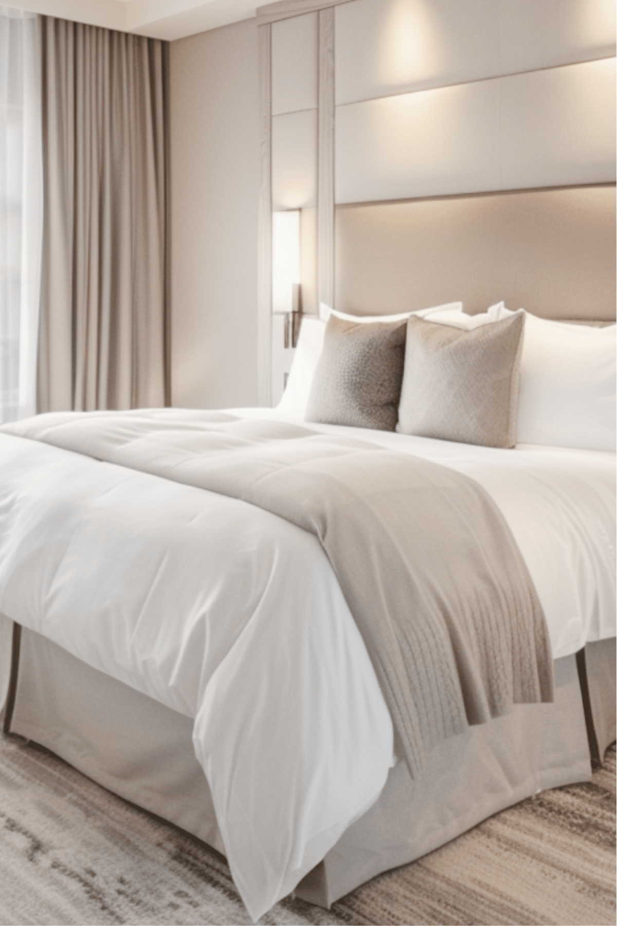
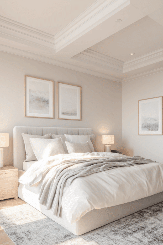
- Warm neutrals, like cream, taupe, and greige, create a grounded backdrop that feels safe and cozy.
For some top picks this year for sleep, stay steady: muted blues, nature-based greens, warm neutrals, and even soft lavender accents for a whisper of color.
Several trend reports point to these calming choices, including overviews of serene bedrooms from sites like House Beautiful and ELLE DECOR.
Colors to Limit
There are a few colors to avoid as well when considering the color palette for your bedroom. Think bright red, bold orange, and punchy yellow, which can possibly raise energy and heart rate.
In addition, heavy black and very dark brown can feel cave-like in small spaces, which may add tension instead of relief.
Save these for tiny accents or art, not bedding or large walls.
How to Choose a Color Shade
Choosing the right color shade isn’t just about picking your favorite paint chip — it’s about how the color feels in your space.
Here are a few things to consider:
- Study your light. North-facing rooms read cooler and can make colors look a bit gray. South-facing rooms are warmer and can make colors look richer.
- Test big samples. Paint large swatches on two walls or use peel-and-stick sheets. Check them in morning light, afternoon light, and at night with lamps.
- Learn LRV. It stands for Light Reflectance Value, which is a simple scale that shows how light or dark a color looks in a room. Higher numbers bounce more light, lower numbers read deeper.
- Use the 60-30-10 balance. Try 60 percent main wall color, 30 percent supporting tones in textiles and furniture, and 10 percent accents. This keeps the space calm, not busy.
Pro tip: Keep it simple, and let your eyes and body be the judge.
Cozy Bedroom Color Palette Ideas that Help You Unwind
Below are four ready-to-use palettes that feel restful and current this year.
I kept these simple because sleepy rooms should be easy on the eyes.
Think sleep sanctuary, cozy colors, and textures that feel soft to the touch.
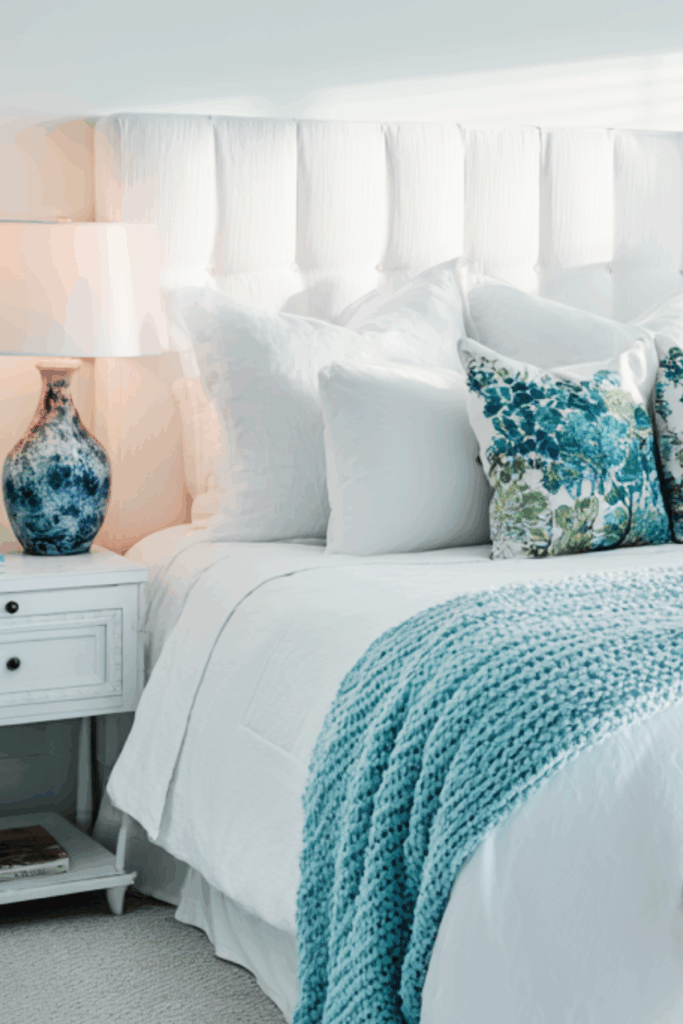
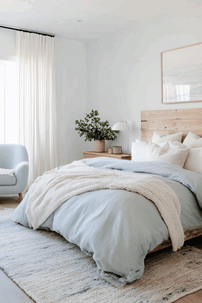
Soft Blue Sky Calm (clear mind, easier bedtime)
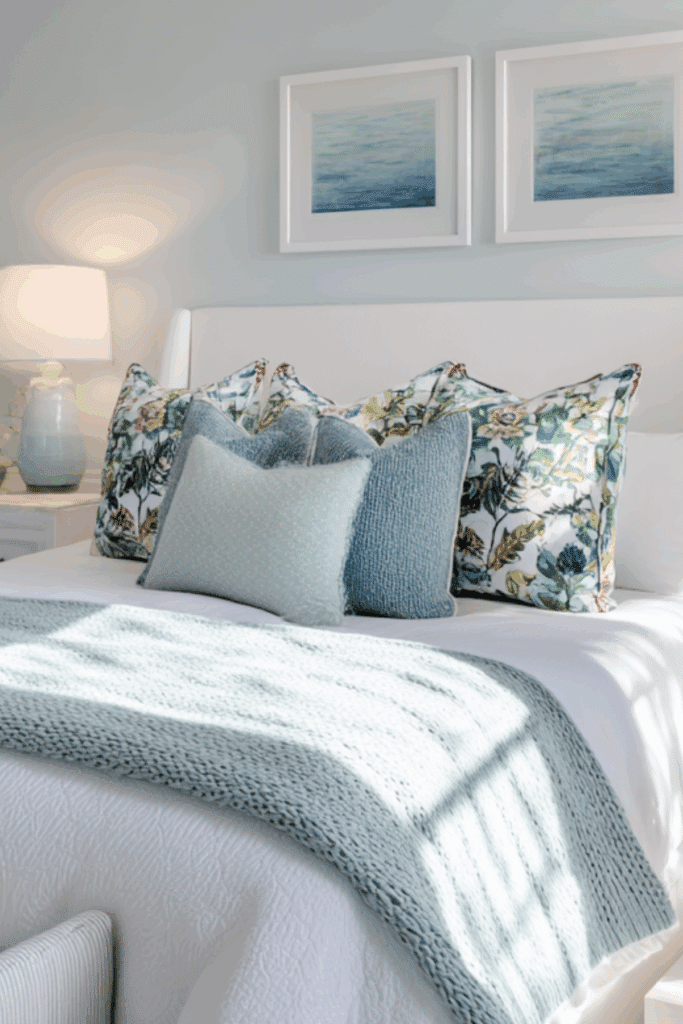
The soft blue sky and calm palette help lower stress and quiet thoughts before sleep.
It feels like fresh air after a long day.
Here’s how it can work for you:
- Plan: Walls in powder or sky blue, trim in crisp white or soft ivory. Bedding in white and warm beige. Add muted denim or slate blue accents.
- Materials: Linen duvet, cotton percale sheets, and a knit throw.
- Wood and metals: Light oak or ash, brushed nickel or soft brass.
- Patterns: Keep them small and quiet, like thin stripes or tiny checks.
Sage and Moss Green Nature Calm (grounded and peaceful)
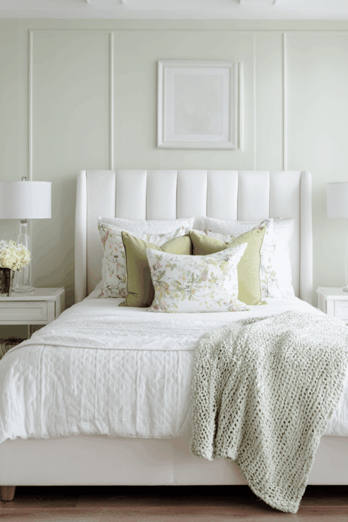
Green brings the outdoors in, which can help you feel balanced and steady.
The mood is restorative, not busy.
- Plan: Walls in sage or soft moss, warm white trim, accents in pistachio or eucalyptus.
- Textiles: Woven jute rug, cotton-linen curtains, a botanical pillow in muted tones.
- Wood and metals: Mid-tone oak or walnut, aged brass.
Warm Neutral Hug (taupe, cream, and cozy layers)
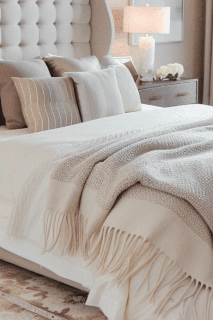
This palette feels safe and quiet.
It is perfect for a restful bedroom color palette that works year-round.
- Plan: Walls in warm taupe or greige, creamy white trim. Accents in camel, oatmeal, and soft terracotta.
- Textiles: Boucle pillow, wool throw, cotton sateen sheets.
- Wood and metals: Walnut or honey maple, warm brass or bronze.
Quiet Lavender Accent (whisper of color without the buzz)
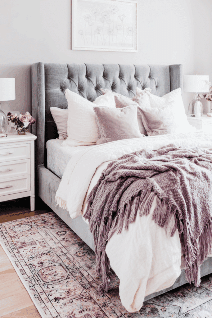
Muted lavender gives a hint of softness without turning sweet or loud.
It is a gentle finishing note for a neutral base.
- Plan: Keep walls neutral, like warm white or light taupe. Add soft lavender in pillows, art, or a throw.
- Pairings: Mushroom gray and cream for balance.
- Wood and metals: Light oak, pearl nickel.
If you want more inspiration on these calming colors for this year, this seasonal trend note points to soft sage, moss, and other restful greens as strong picks, see Top Bedroom Color Trends to Try This.
Make Your Bedroom Color Palette Work Night After Night

Once your colors are set, finish the space so your eyes and body relax on cue.
Think soft textures, gentle light, and a tidy routine that protects melatonin.
Bedding, Rugs, and Curtains

Pick breathable cotton or linen sheets in white, cream, or pale tints.

Add a soft rug that echoes your palette so your feet feel warm.

Choose blackout or layered curtains to block light leaks.
Lighting
Use warm bulbs in the evening, ideally with dimmers.
Bedside lamps with fabric shades in warm white or cream soften the glow.
Avoid strong blue light at night.
Match Woods and Metals to your Color Palette

Tie wood tones to wall warmth.
Light oak works with cool blues.
Walnut pairs well with warm taupe.
Pick one metal finish, like aged brass or brushed nickel, and repeat it in lamps and frames.
Repeating finishes keeps the room quiet, not busy.
Use the 60-30-10 Rule
Once you’ve picked your main shades, it’s time to think about how they all work together in the room.
Layering colors in a thoughtful way keeps the space feeling calm and cozy instead of busy or overwhelming.
That’s where a simple guideline like the 60-30-10 rule can be a lifesaver — it helps you balance walls, furniture, and accents so your bedroom feels inviting and perfectly put together.
- 60 percent: calm wall color.
- 30 percent: medium tones in bedding and the rug.
- 10 percent: accents like pillows or one art piece.
Sample list: paint, two sets of sheets, a duvet cover, a knit throw, two lamps with warm bulbs, blackout curtains, and one piece of art in a soft accent color.
This simple setup gives you everything you need to create a calm, cozy bedroom without feeling cluttered or overdone.

Final Thoughts
Just like that sleep doctor I met years ago, who surrounds himself with calming blues to help him relax, the colors in your bedroom can send signals to your brain that it’s time to unwind.
By choosing from these bedroom color palette ideas, it really creates that perfect feeling of cozy and soothing.
Whether you select soft blues, gentle greens, warm neutrals, or a touch of lavender, you can create a space that quietly encourages better sleep every night.
Start with your walls, add a few soft accents, and notice how your room begins to feel like a true retreat.
Your bedroom doesn’t have to be perfect — it just has to feel calm, inviting, and ready for sleep.
Need some extra help relaxing before bedtime? Check out this sleep meditation free printable!
Your Turn
Now it’s your turn to create a bedroom that actually helps you relax and sleep better. Which colors feel most calming to you — soft blues, gentle greens, warm neutrals, or a hint of lavender? Let me know in the comments.
RELATED POSTS:
- Cozy Bedroom Ideas for Better Sleep: Easy Tips to Create a Sleep Sanctuary
- Cozy Zen Bedroom Ideas to Create a Sleep Sanctuary with a Color Palette, Bedding, Pillows, and More
- Relaxing Bedroom Ideas for Better Sleep (Even in a Small Room)
- Top 15 Bedroom Essentials: My Must Have List for Better Sleep
- The Best Sleep Investment I’ve Ever Made (and Why It’s the BedJet Sleep System)
- How to Build a Sleep Routine That Actually Works
- Sleep Hygiene Tips That Work [Free Printable Checklist Included]
- How To Choose The Right Size Of Mattress Buying Guide
- How to Choose the Best Bed Pillow For Sleeping (Tips From an Expert)

Hi, I’m Debbie, general manager of a mattress store chain with 25+ years helping people improve their sleep quality. At Sweet Sleep Tips, I share natural, practical sleep solutions, calming bedtime habits, and printable tools to help you fall asleep faster and wake up refreshed. My goal is to make better sleep simple, healthy, and stress-free.
Follow me on Pinterest, Instagram, and Facebook to stay up to date with all the latest Sweet Sleep Tips.


I’m currently loving the soft blue and green tones for our master bedroom. It feels very spa-like and restful. Thanks for sharing these great tips for a cozy bedroom.
I love these suggestions! I’ve been struggling to figure out what color scheme to pick for my room and I think this helped!
I mostly use blue and grey tones for my bedding. These color palettes are lovely and I do think they bring a sense of calmness.